Alrighty. 🙂
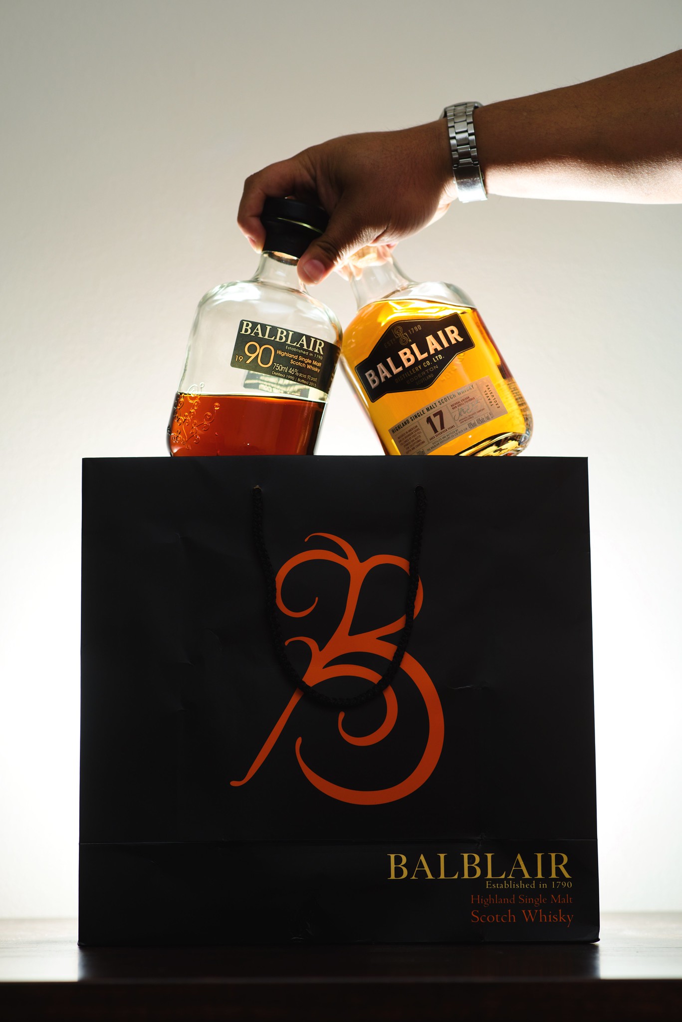
Something we don’t talk about on ScotchNSniff all that much is design. There have been a ton of brands rebranding and changing up their bottle and packaging design lately and though this doesn’t always immediately affect the look of your local store, once old stock is gone, it definitely will. Macallan made their bottles more masculine by bringing the shoulders up and making them wider. Balblair ditched their “vintages” and moved to easy-to-read age statements. Old Pulteney added some gorgeous details to their already nautical designs. There are a bunch of new designs mixing up the look of the whisky market.
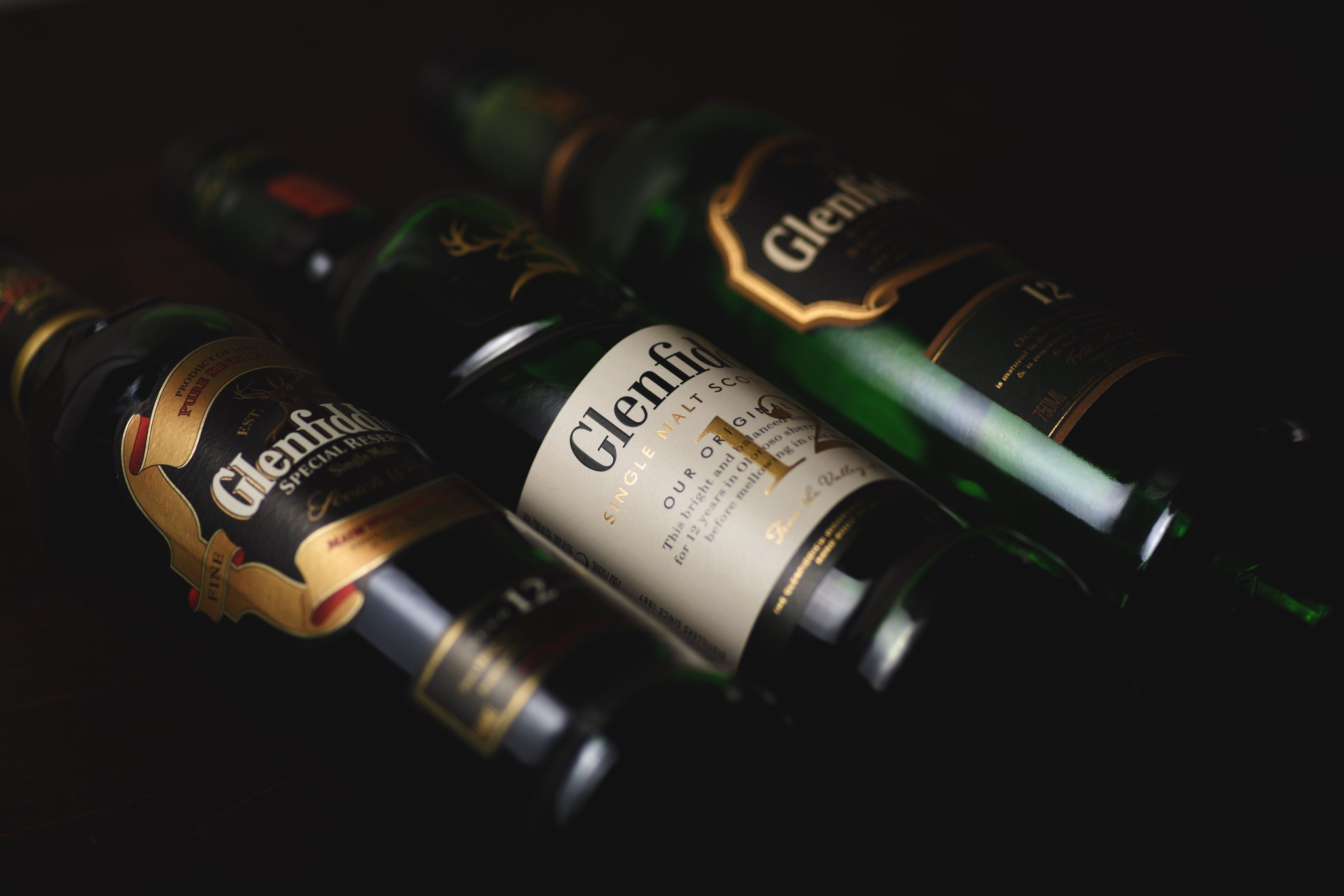
One of the redesigns I didn’t expect and was really anticipating was the Glenfiddich redesign. Granted, it’s not slated to come stateside for a few months still, it didn’t stop me from ordering one of the new bottles from The Whisky Exchange! I definitely suffered in shipping to get the bottle here but I’m glad I finally got to see the bottle in person. Glenfiddich re-hired HereDesign to create the new look for the line up and apparently the refresh will happen over a period of a couple of years starting with the 12, 15, and 18 year expressions. HereDesign is the same group responsible for the look of the Experimental series from Glenfiddich and the new Balvenie stories lineup.

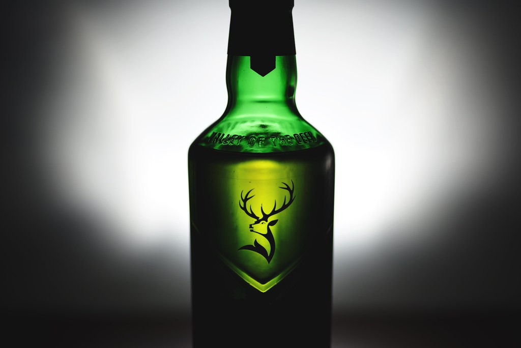
When I first saw the new Glenfiddich bottle my immediate thought was “OH NO. The chevron is already used heavily by Macallan!”. Personally, I love the chevron design in Macallan glasses and was really afraid of the Glenfiddich bottle carrying the same marque but Glenfiddich says it’s to represent the Valley of the deer (which is embossed in the glass just above the bottle neckline). And I get it… but I wonder if other people will notice the same detail.
Also, due to the optical illusion created by the chevron shape, I thought the bottom of the bottle below the chevron would be wider than the upper portion but it’s not. It’s amazing how some light on a shape can create spatial ideas in our mind that aren’t always rooted in physical reality but the reality of what our mind is capable of generating!
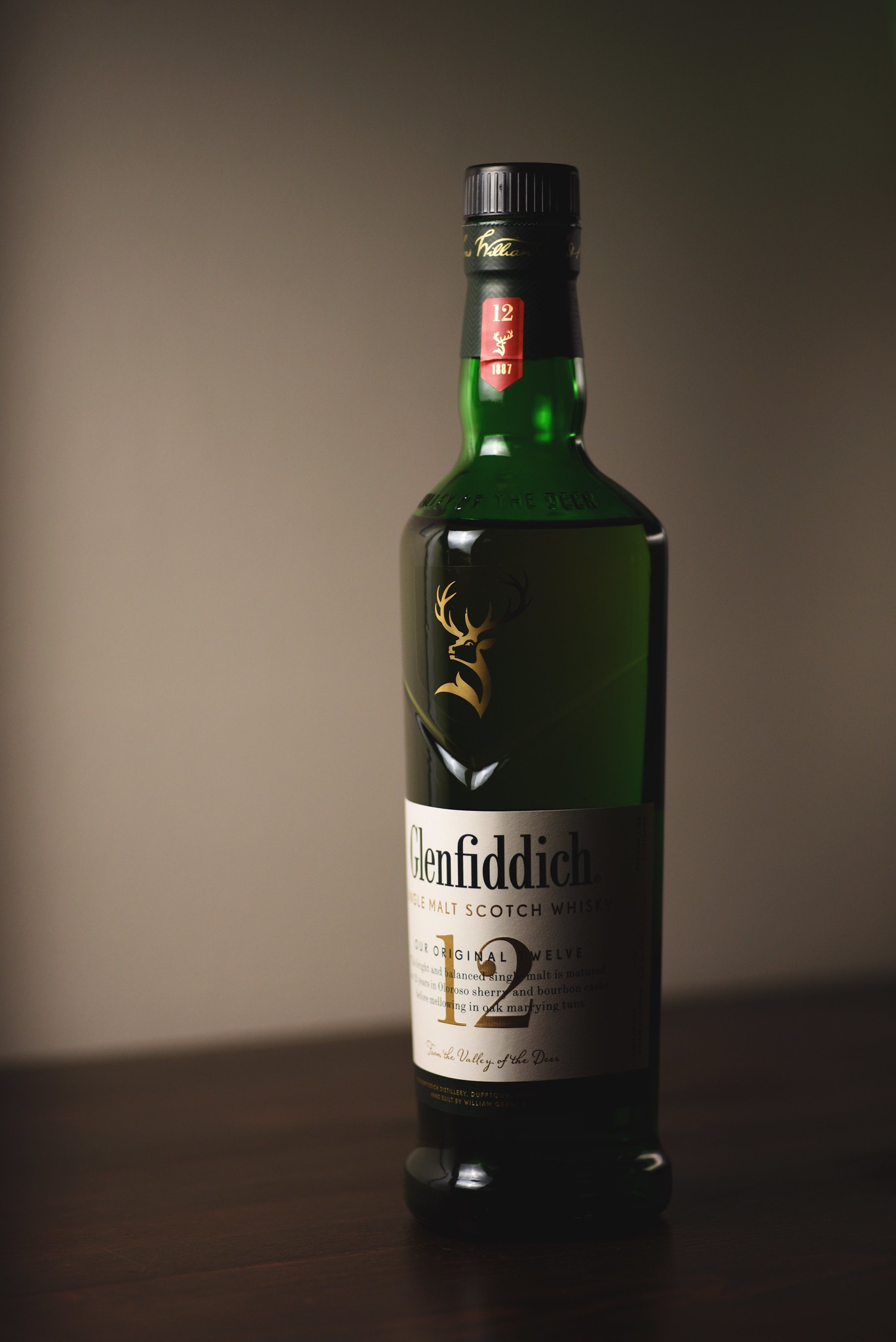
Another interesting design detail is the red banner at the very top of the bottle. It’s weird because I’ve never noticed red details on Glenfiddich bottles until this one but going back and looking at older bottlings, it IS a common occurrence. It occurs on the newest bottling with the year, a stag, and the “1887” representing the year Glenfiddich was established.
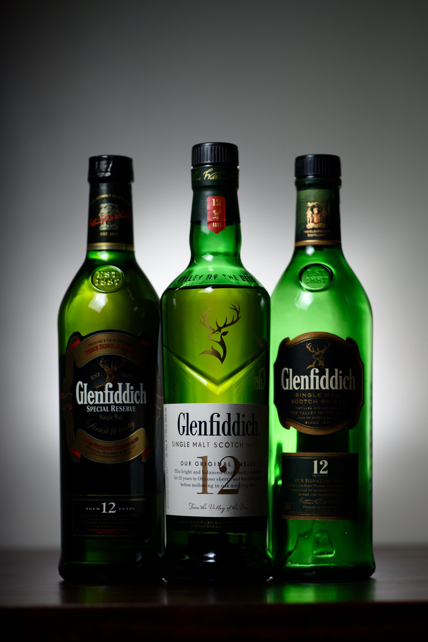
The 12 year statement is huge now and the words about the actual bottling’s makeup are now pretty snazzily printed right across it. In really gorgeous script below is “From the valley of the deer”, also.

So there you have it! A walk around of the new Glenfiddich bottle that’ll soon be in stores! A number of my friends on IG have asked if I’m being paid for this or if this is all a part of an ad but I’m just a giant GF fan boy that wanted to be first in having a bottle here to talk about. I got a DM from a brand ambassador saying they didn’t even have a bottle yet and that made my life. 🙂
What do you think of the new design? Did they do it well? Poorly? Let me know!
Slainte!
-Sniff